

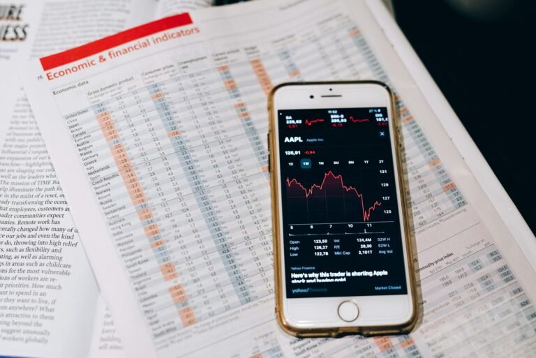
The quiet revolution hiding in your data
Remember that summer evening when I was analyzing a retail client’s economic dashboard during a power outage? The screen flickered, but the numbers stayed crystal clear-weekly foot traffic dropping by 12% in one zip code while sales held steady in others. That’s not just a dashboard; it’s a real-time diagnostic tool revealing what the headlines couldn’t. Most industries treat economic dashboards as fancy spreadsheets, but the companies using them right see them as strategic early-warning systems. The difference? Context. Without it, you’re just staring at numbers instead of reading a story-one where supply chains whisper before they scream, and consumer habits shift faster than a stock ticker.
Economic dashboards aren’t about pretty graphs. They’re about turning raw data chaos into actionable intelligence. Walmart’s global supply chain team used one during the pandemic to spot trucking bottlenecks weeks before they hit news cycles. Their dashboard layered real-time GPS data, port congestion reports, and historical delivery times-revealing that a single California port’s slowdown would cripple 20% of their U.S. distribution. The key insight? The dashboard didn’t just show *what* was happening-it showed *why* and *when* to act.
Why most economic dashboards fail
I’ve watched CFOs dismiss their own dashboards as “just spreadsheets with better graphics.” The issue isn’t the technology-it’s the fundamental design flaws that turn them from significant developments into noise machines. Here’s how to avoid the pitfalls:
- Overloading with metrics. Dashboards with 50+ KPIs are worse than useless. Experts suggest focusing on 3-5 “leading indicators” that predict trends before they appear. For a semiconductor manufacturer, that might mean tracking *wafer inventory turns* rather than lagging *quarterly profit margins*.
- Ignoring real-time needs. A cryptocurrency exchange’s dashboard needs updates every 15 minutes with volatility alerts. A brewery tracking hops prices? Daily updates suffice. The dashboard must match the industry’s pace.
- Silos over integration. The 2022 chip shortage caught many off guard because their dashboards only showed sales data-not global trade tariffs or labor strike risks. Context is king.
In practice, the best dashboards answer one critical question upfront: *”What decision will this help us make?”* Without that focus, you’re left with a dashboard that looks impressive but feels like a puzzle with missing pieces.
How Delta turned fuel costs into a science
Delta Air Lines didn’t just monitor fuel prices-they made fuel management a dynamic, data-driven sport. Their economic dashboard blends:
- Real-time jet fuel prices
- Historical weather patterns
- Pilot availability metrics
- Air traffic flow projections
The result? A system that flags opportunities like: *”Rerouting the 8 AM Seattle-to-LA flight could save $120,000 daily by avoiding a storm-induced delay.”* But here’s the genius part: the dashboard ties fuel savings to crew scheduling-so the financial benefit isn’t just theoretical. It’s executed in real time. This isn’t just cost-cutting; it’s economic agility-adapting faster than competitors can even react.
Your turn: Building dashboards that work
You don’t need a $100,000 budget to start. Begin with one burning question-like *”Are we prepared for a 5% demand drop?”*-then layer data to answer it. For small businesses, tools like Google Data Studio’s free tier can combine bank transaction data with local unemployment trends. Pro tip: Test your dashboard’s “emergency mode.” Can you spot a cash-flow crisis in three clicks? If not, it’s not ready.
And remember: the best dashboards feel like conversations, not reports. Involve stakeholders early-a brewery’s dashboard needs input from supply chain, sales, *and* marketing. Ask: *”Who would yell at this screen when it’s wrong?”* That’s your audience. Start small. Stay curious. And never ignore the anomalies-they’re where the best insights hide.


